 Access path:
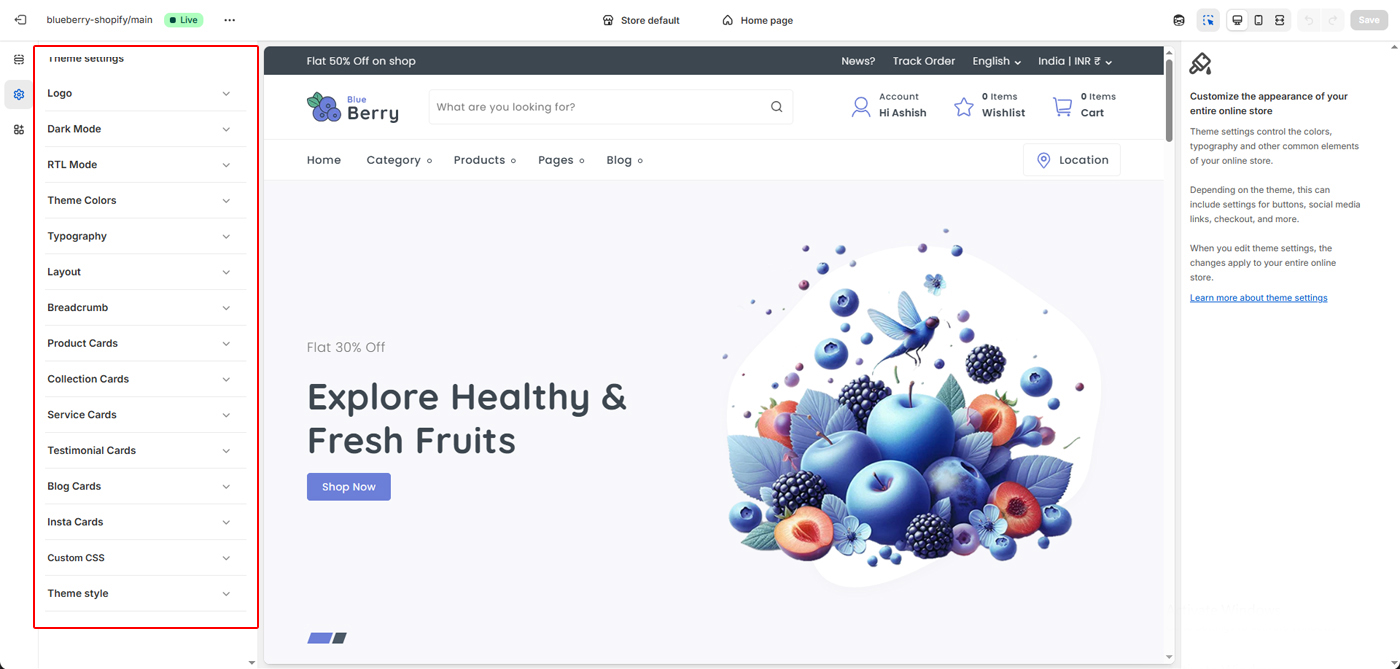
Online Store → Themes → Customize → Theme settings
Logo Settings
The Logo settings allow you to upload and manage your store’s brand identity across different display modes and devices. Upload your main store logo. This logo is displayed in the header across your entire website.
Best practices:- Use a transparent PNG for best results
- Recommended width: 125px–200px
- Ensure good contrast with the header background
Online Store → Themes → Customize → Theme settings → Logo
Dark Logo
Upload an alternate logo for Dark Mode. This logo is automatically used when dark mode is enabled to ensure visibility and brand consistency.
Notes:- Use a light-colored logo
- Avoid dark or low-contrast designs
- Recommended format: PNG
Favicon Image
Upload a favicon image that appears in the browser tab, bookmarks, and mobile shortcuts.
Notes:- The image recommended size 32 × 32 pixels
- Use a simple icon or brand mark
- Square image recommended
Dark Mode allows you to switch your store’s appearance to a darker color scheme, providing a modern look and a more comfortable viewing experience in low-light environments.
- Reduces eye strain for users
- Improves readability in dark environments
- Enhances modern and premium visual appeal
When enabled, the theme automatically adjusts background colors, text colors, and UI elements to match the dark color palette.
Tip: Make sure you upload a compatible Dark Logo for best visibility.
RTL Mode enables right-to-left layout support for languages such as Arabic, Hebrew, and Persian, ensuring proper text alignment and natural reading flow.
- Automatically flips layout direction to right-to-left
- Aligns text, menus, and UI elements correctly
- Improves usability for RTL language audiences
When enabled, the theme adjusts spacing, alignment, and navigation structure to match RTL language conventions.
Tip: Use RTL-friendly fonts for the best reading experience.
Theme Colors allow you to customize the overall color scheme of your store to match your brand identity and visual style.
- Primary Color: Used for Titles, buttons, links, highlights, and key call-to-action elements.
- Secondary Color: Applied to secondary Titles, buttons, icons, and supporting UI elements.
- Title Color: Controls the color of headings and titles across the store.
- Text Color: Sets the default color for body text and content.
- Border Color: Defines borders for cards, inputs, dividers, and layout elements.
- Light Gray Background: Used for section backgrounds and subtle layout contrast.
- Hero Shape Color: Controls decorative shapes used in hero and banner sections.
Changes made here are applied globally across your store for a consistent and professional appearance.
Tip: Choose colors with sufficient contrast to ensure good readability and accessibility.
Typography controls the fonts and text styles used across your store, helping you create a clear visual hierarchy and consistent reading experience.
- Heading Font: Applied to all headings (H1–H6), section titles, banners, and important labels. Choose a font that reflects your brand personality and stands out visually.
- Body Font: Used for paragraphs, descriptions, product details, and general content. Select a clean and readable font for better user experience.
- Font Size & Weight: Adjust sizes and weights to create proper contrast between headings and body text.
Typography changes are applied globally across your store to ensure a consistent and professional look on all pages.
Tip: Use bold, distinctive fonts for headings and simple fonts for body text to improve clarity and readability.
Layout Options allow you to control spacing and corner radius across your store to create a clean, balanced, and modern layout.
- Spacing Between Sections: Adjust the vertical gap between sections to make your pages feel more compact or more open. Larger spacing improves visual clarity, while smaller spacing creates a dense layout.
- Global Layout Radius: Control the roundness of cards, images, buttons, and containers across the theme.
- Radius Sizes (SM, MD, LG, XL, XXL): Choose different border-radius values for small to extra-large elements, allowing fine-grained design control.
- Consistent Design: All radius and spacing settings apply globally to maintain a uniform look throughout the store.
These settings help you match your store’s visual style—whether you prefer sharp edges, soft rounded corners, or generous white space.
Tip: Use larger spacing and softer corners for modern, minimal designs, and smaller spacing with sharp corners for compact layouts.
Breadcrumb Navigation helps customers understand their current location within your store and easily navigate back to previous pages. This settings you can allow show or hide breadcrumb.
- Improved Navigation: Displays a clear path from the homepage to the current page, enhancing usability.
- Better User Experience: Allows visitors to quickly move between categories and pages without using the browser’s back button.
- SEO Friendly: Breadcrumbs help search engines understand your site structure and improve content indexing.
- Clean Layout: Designed to stay minimal and unobtrusive while keeping navigation intuitive.
Breadcrumbs are especially useful on collection and product pages, helping customers explore your store with ease.
Product Cards control the appearance and layout of products across collection pages, sliders, and featured product sections.
- Card Layout: Adjust padding, background color, border thickness, and corner radius to match your brand style.
- Shadows & Depth: Customize shadow opacity, blur, and position to create subtle or bold card depth.
- Image Styling: Control image padding and border radius for clean, consistent product visuals.
- Product Details: Choose which information to display, including category, old price, and product weight.
- Text Alignment: Align product titles left, center, or right for better layout balance.
These settings apply globally to all product cards, ensuring a consistent and professional look throughout your store.
Collection Cards control how your product collections are displayed across the store.
- Card Spacing: Adjust padding to create comfortable spacing and improve visual balance.
- Collection Image: Show or hide collection images for a clean or image-rich layout.
- Item Count: Display the number of products in each collection to help customers explore faster.
- Border Styling: Control border thickness for subtle or defined card outlines.
- Consistent Design: Ensure all collection cards follow the same style for a polished look across your store.
These settings apply globally to all collection cards, keeping your category layout clean, organized, and easy to navigate.
Service Cards are used to highlight key services, features, or store benefits such as fast delivery, secure payments, or customer support.
- Card Padding: Adjust the internal spacing to keep service content clean and readable.
- Card Color: Set the background color for service cards to match your store design.
- Border & Shadow: Customize border thickness and shadow settings to create subtle or elevated card styles.
- Service Image: Enable or disable images or icons for each service item.
- Image Alignment: Align service images to the left, center, or right for better layout balance.
- Title Alignment: Control how service titles are aligned within each card.
These settings apply globally to all service cards, helping you present important store features in a consistent and professional way.
Testimonial Cards help build trust by showcasing real customer feedback, reviews, and experiences with your store.
- Name Alignment: Choose how the customer name is aligned inside the testimonial card.
- Designation: Enable or disable the customer designation, such as profession or role.
- Designation Alignment: Control the alignment of the designation text for a clean layout.
- Card Color: Set the background color of testimonial cards to match your theme style.
- Border Thickness: Adjust the border size to create minimal or highlighted testimonial cards.
These settings apply globally to all testimonial cards, ensuring consistent styling and a professional appearance across your store.
Blog Cards control the visual appearance of blog posts across your store, helping you present content in a clean, readable, and engaging layout.
- Border Thickness: Adjust the border size of blog cards for a minimal or more defined look.
- Card Styling: Blog cards automatically inherit your theme colors and typography settings for a consistent design.
- Responsive Design: Blog cards adapt seamlessly across desktop, tablet, and mobile devices.
These settings apply globally to all blog cards, ensuring a uniform and professional blog layout throughout your store.
Insta Cards display Instagram-style content in a clean card layout, maintaining visual consistency with your blog and store design.
- Border Thickness: Control the border size for a subtle or highlighted card appearance.
- Consistent Styling: Insta cards follow your theme’s global colors and typography settings.
- Responsive Layout: Cards adapt smoothly across all screen sizes.
These settings ensure a polished and cohesive social content presentation across your storefront.