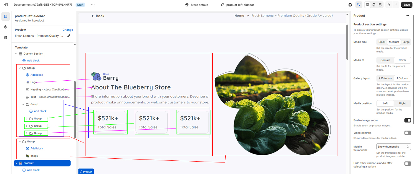
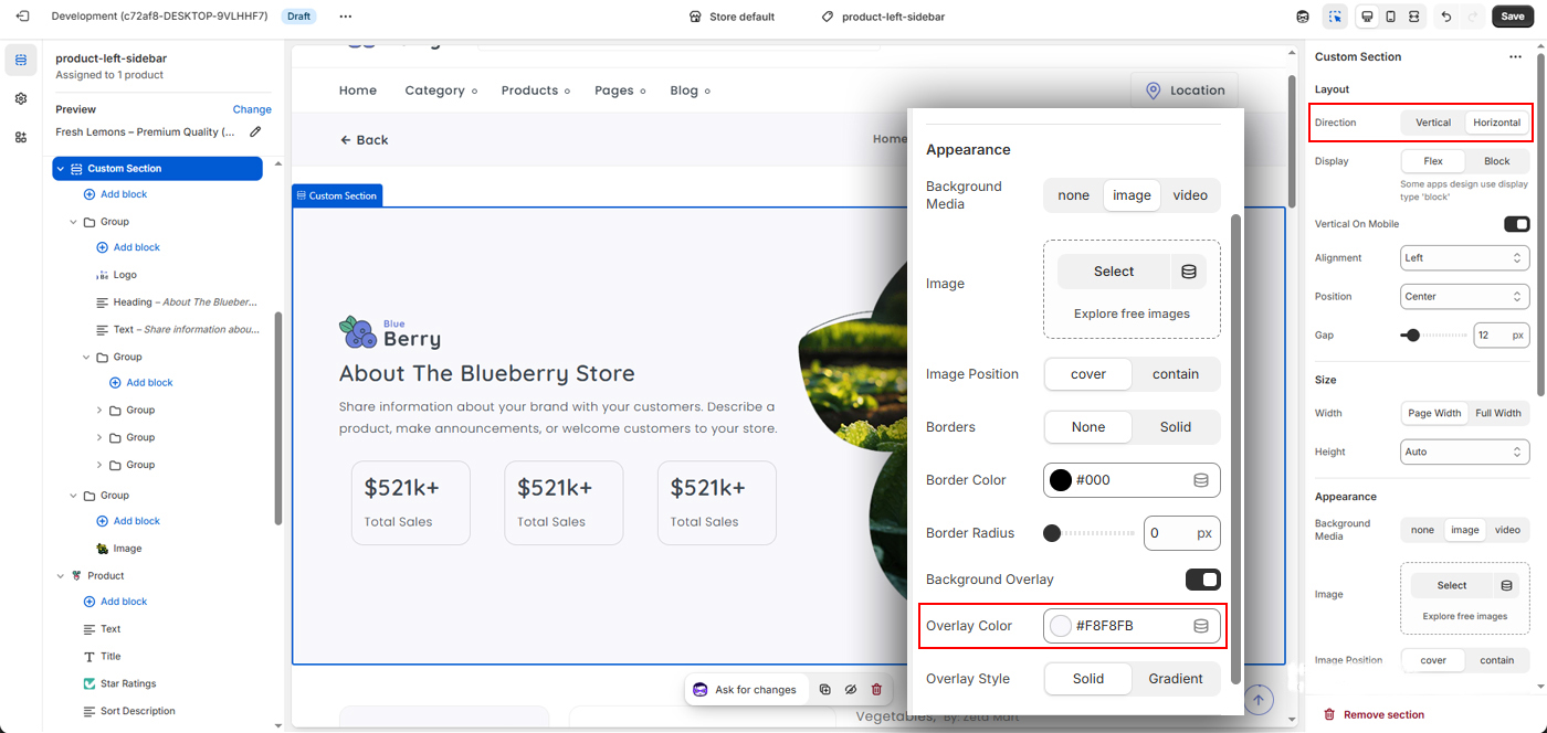
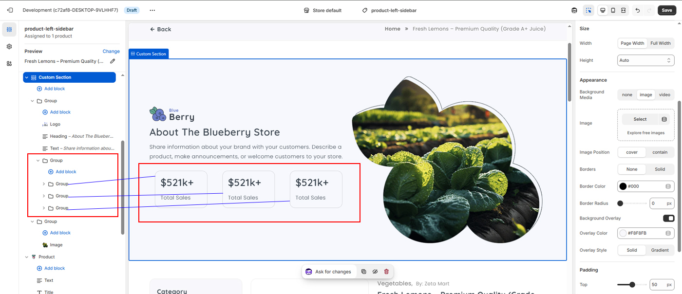
1) Custom Section
Add custom section to your layout.
Go to settings and set Direction = horizontal & backbround color using Overlay Color = #F8F8FB
2) Then make two group
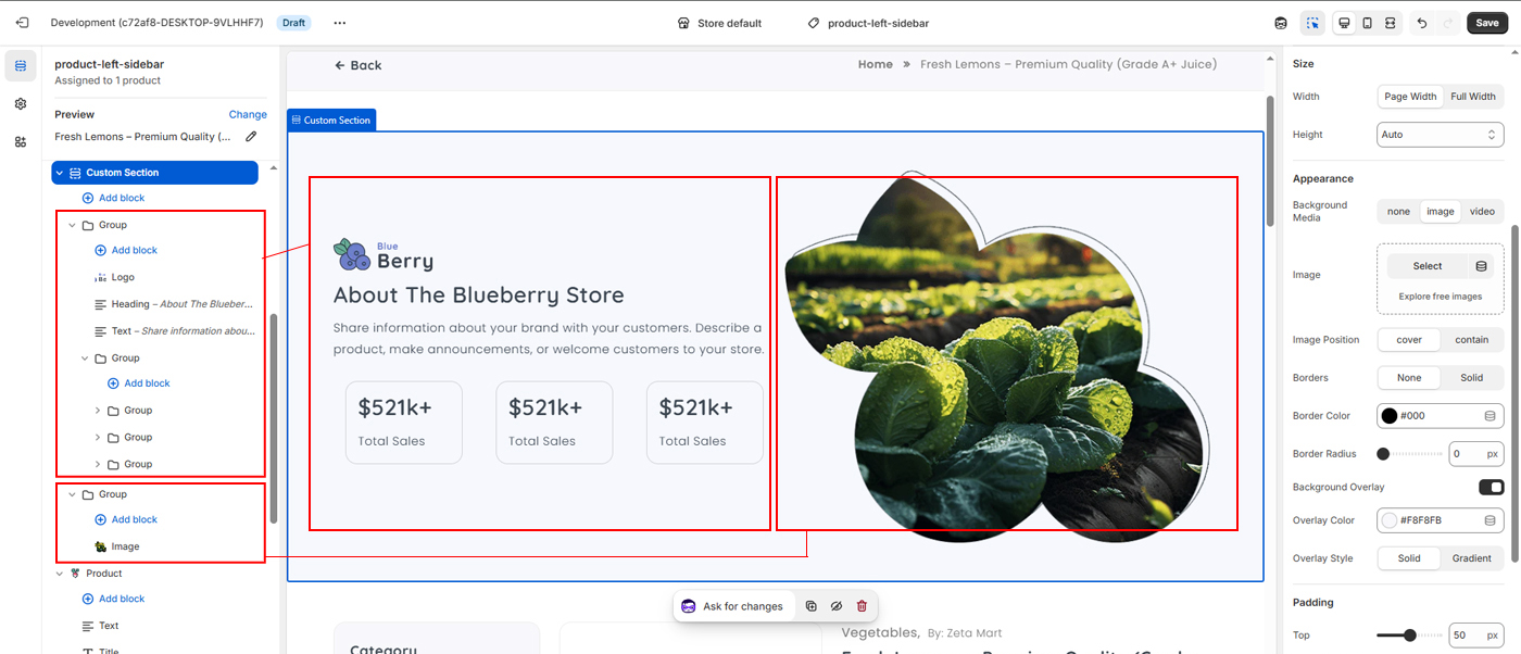
3) Add Logo, Heading, Text and Group inside the first Group
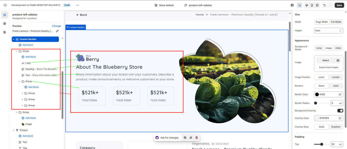
4) Add Three Group inside the Chiled Group
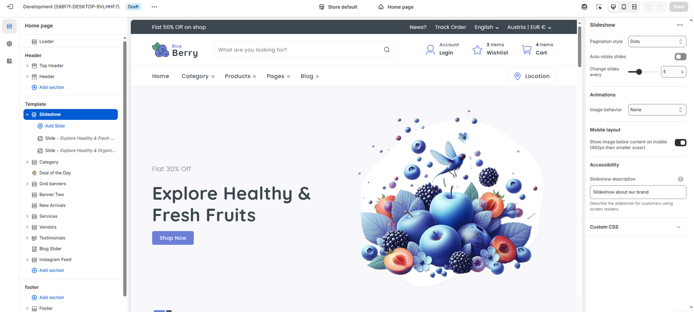
Use these settings to control the appearance and behavior of the slideshow on your home page. You can manage slide pagination style, enable or disable auto-rotation, adjust the slide change interval, apply image animations, and configure how content is displayed on mobile devices. An accessibility description can also be added to help screen-reader users understand the slideshow content.
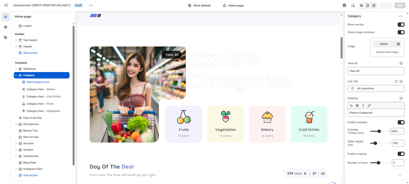
Use these settings to control the display and behavior of the category slider on your home page. You can show or hide the section and image container, upload a featured image, customize the heading and “View All” link, and connect it to a collection page. Slider options allow you to enable autoplay, adjust autoplay timing and transition speed, enable looping, and control the number of visible category items. These settings help you create an engaging and easy-to-navigate category browsing experience.
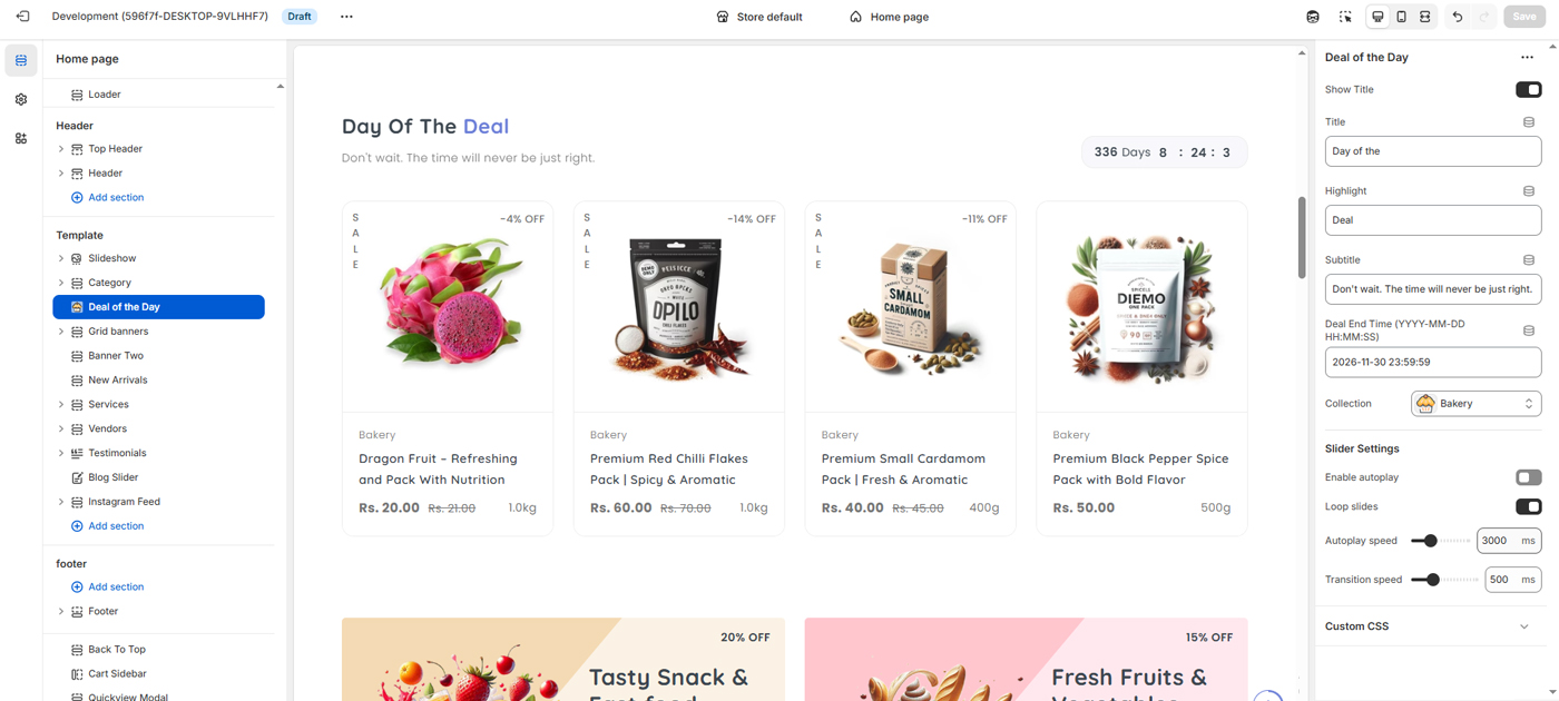
Use these settings to manage and customize the Deal of the Day section on your home page. You can show or hide the section title, update the title, highlight text, and subtitle, and set the deal end date and time to display a countdown timer. Select a product collection to feature discounted items, and control slider behavior with options such as autoplay, looping, autoplay speed, and transition speed. These settings help you promote time-limited offers and increase customer urgency.
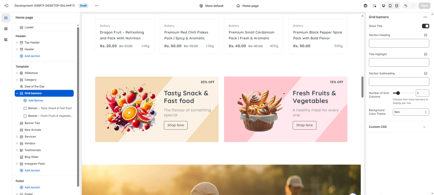
Use the Grid Banner settings to create visually engaging promotional banners on your home page. You can upload banner images, customize banner titles and subtitles, set discount values with labels, and add call-to-action button text and links. Options such as content direction, background color, and layout allow you to control the appearance of each banner. These banners are ideal for highlighting offers, featured categories, or special promotions.
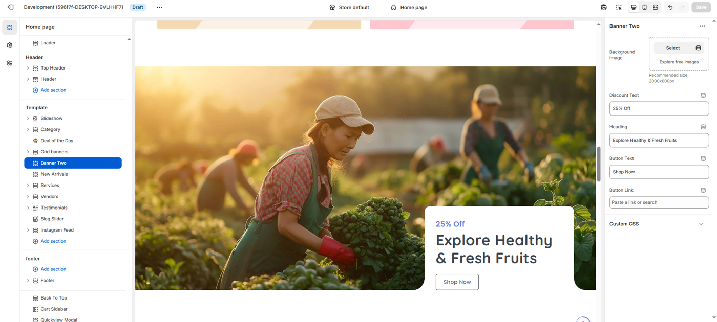
Use this section to showcase a large promotional banner on your home page. You can upload a background image, add discount text and a main heading, and customize the call-to-action button text and link. This section is ideal for highlighting seasonal offers, featured collections, or special promotions with strong visual impact.
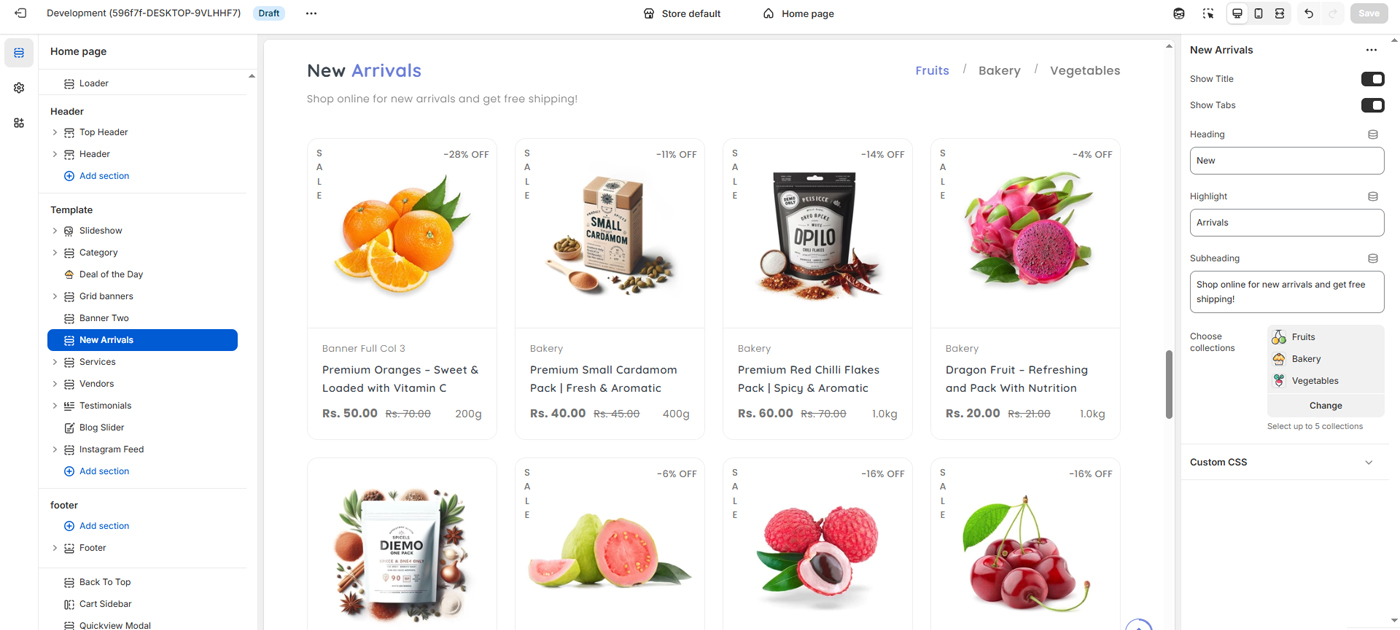
Use this section to showcase the latest products in your store. You can show or hide the section title and tabs, customize the heading, highlight text, and subheading, and choose up to five collections to display. This section helps customers quickly discover new products across different categories.
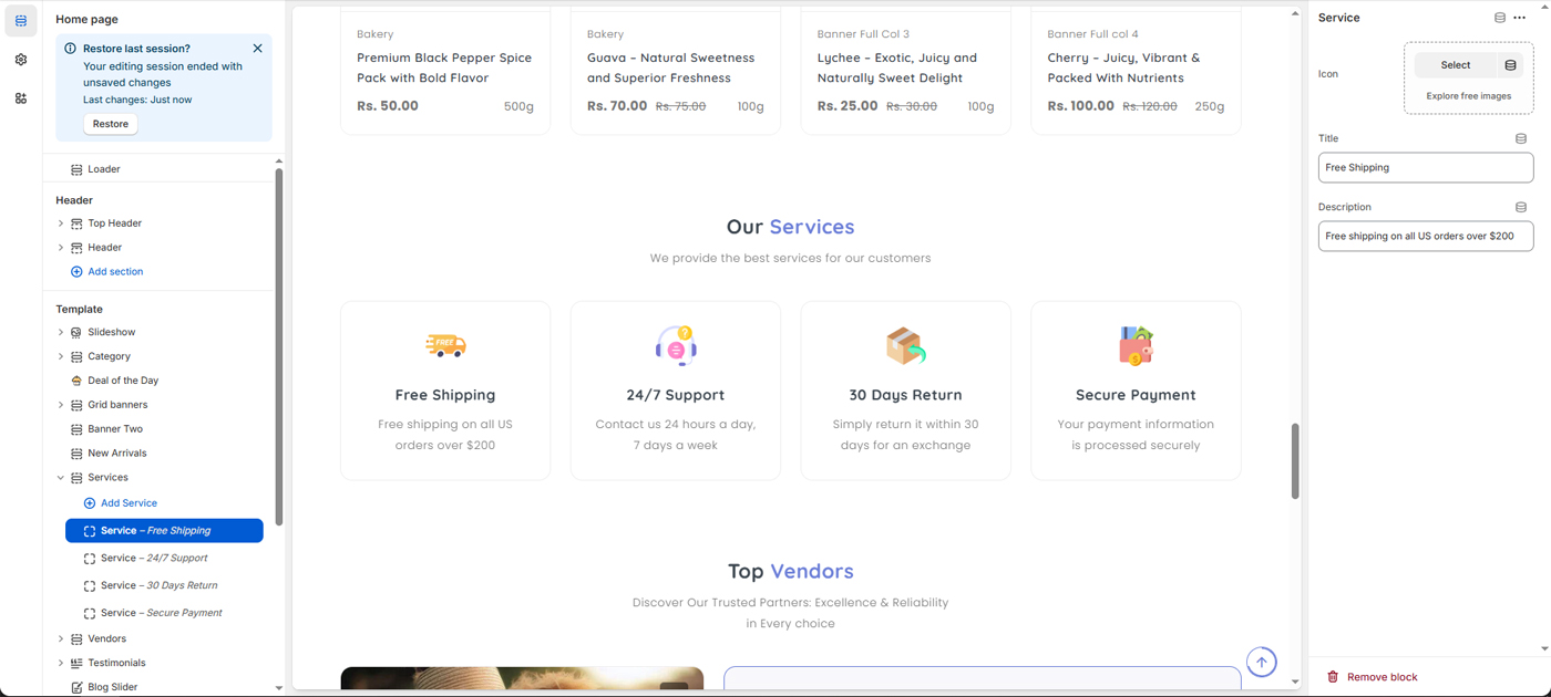
Use this section to highlight the key services and benefits your store offers. You can add service blocks with icons, titles, and short descriptions to showcase features such as free shipping, customer support, returns, and secure payments. This section helps build customer trust and clearly communicates your store’s value.
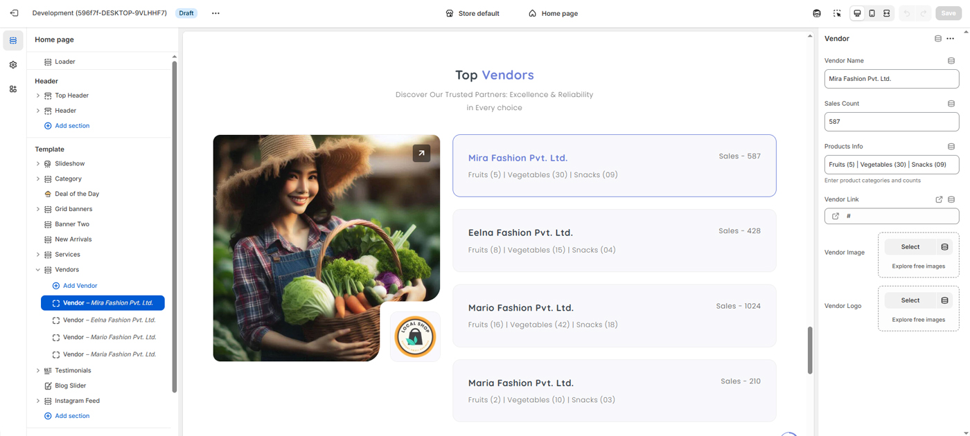
The Vendor Section is designed to showcase top-performing and trusted vendors on the homepage. It highlights key vendor details such as brand identity, product categories, and sales performance to help customers quickly discover reliable sellers and explore their offerings.
- Vendor Name – Displays the brand or company name.
- Vendor Image & Logo – Visual representation to improve brand recognition.
- Product Categories Summary – Shows available product categories with item counts (e.g., Fruits, Vegetables, Snacks).
- Sales Count – Indicates vendor popularity and performance.
- Vendor Link – Redirects users to the vendor’s dedicated page or product collection.
The section also supports a title and short subtitle at the top, allowing store owners to communicate trust, quality, and reliability. All content is fully customizable through theme settings, enabling easy updates without code changes.
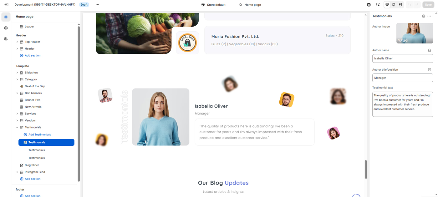
The Testimonials Section is designed to build customer trust and credibility by showcasing real feedback from satisfied customers or partners. It highlights positive experiences, product quality, and service reliability through visually engaging testimonial cards.
- Author Image – Displays the customer’s photo for authenticity.
- Author Name – Name of the customer providing feedback.
- Author Title/Position – Role or designation (optional) to add credibility.
- Testimonial Text – Customer review or feedback message.
The section supports multiple testimonials and presents them in an attractive, modern layout to enhance social proof. All testimonial content can be easily managed from the theme customizer, allowing store owners to update images, text, and author details without modifying code.
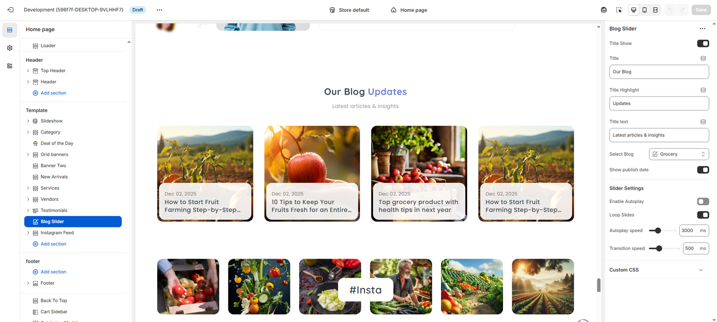
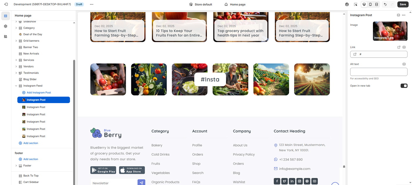
The Blog Slider Section displays recent blog posts in a responsive, horizontally scrolling slider layout. It helps highlight the latest articles, news, tips, and insights, encouraging visitors to explore valuable content and stay engaged with the store.
- Section Title & Highlight Text – Customize the main heading, highlighted word, and subtitle text.
- Blog Selection – Choose which blog to display posts from.
- Post Preview Cards – Each slide shows the featured image, publish date (optional), and post title.
- Publish Date Toggle – Option to show or hide the article publish date.
- Autoplay Slider – Enable or disable automatic sliding.
- Loop Slides – Continuously loop blog posts in the slider.
- Autoplay & Transition Speed – Control animation and slide timing.
- Custom CSS Support – Apply custom styling if needed.
All settings are managed through the theme customizer, allowing store owners to control content visibility, animation behavior, and layout without editing code. This section is ideal for promoting blog content, improving user engagement, and supporting content-driven SEO strategies.
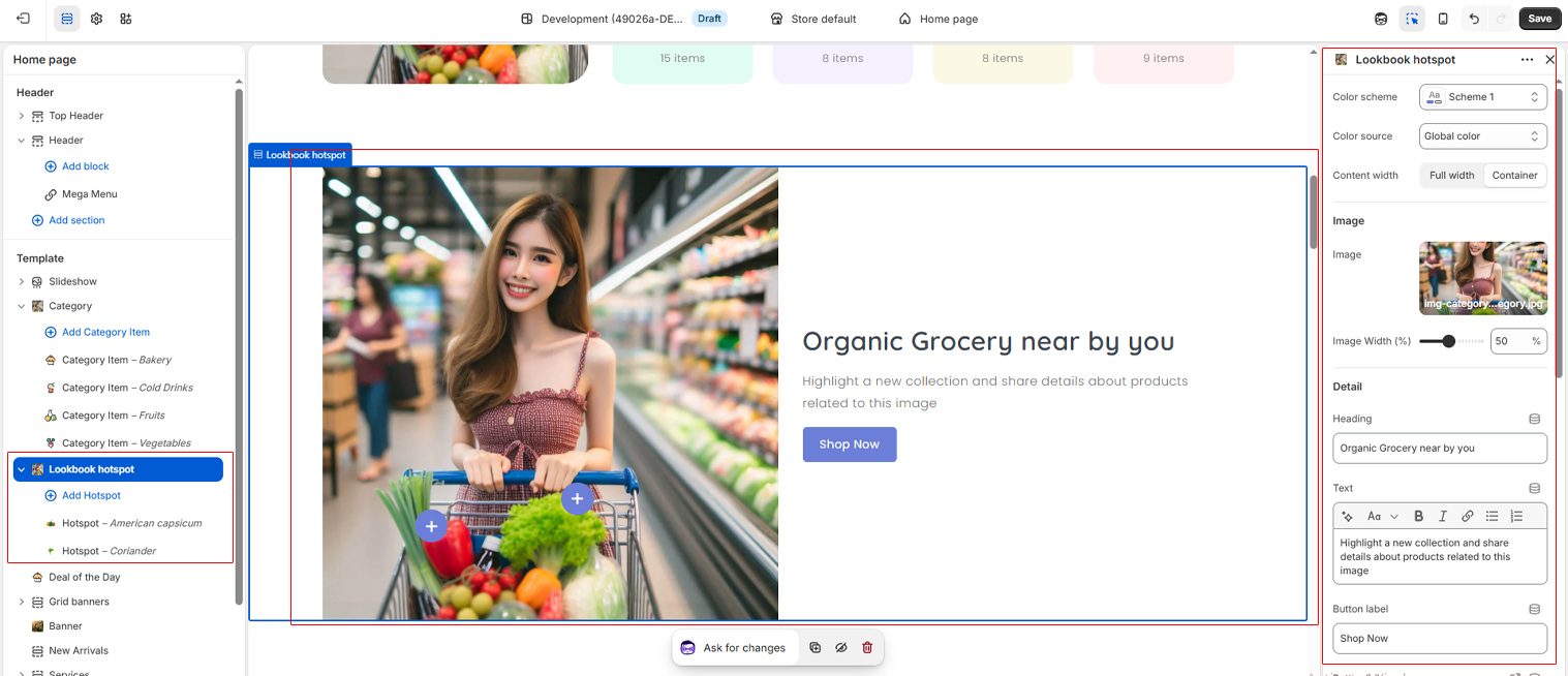
Use these settings to control the display and behavior of the lookbook on any page. You can show or hide the section and image container, upload a lookbook image, customize the heading and button, and connect it to a collection page or product page. These settings help you create an engaging and easy-to-navigate product browsing experience using image focus points.
Add Hotspot
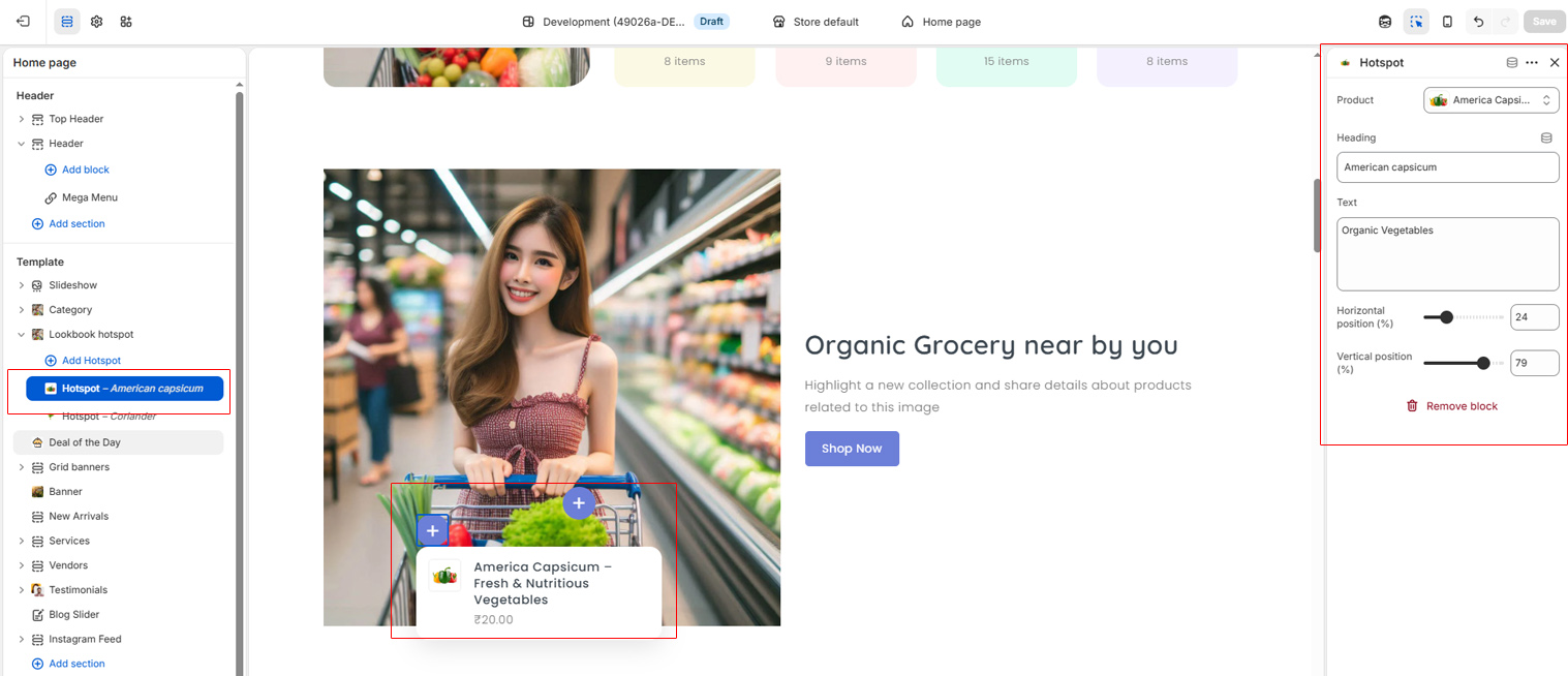
Here you can add blocks for focal points in the image to show product details. Select product from right sidebar settings. and adjust your focal point on image with product details.
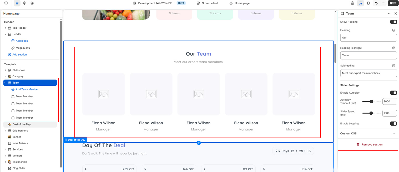
Use these settings to control the display and behavior of the Team on any page. You can show or hide the section, Slider options allow you to enable autoplay, adjust autoplay timing and transition speed, enable looping etc. These settings help you create a team section on every page.
Add Members
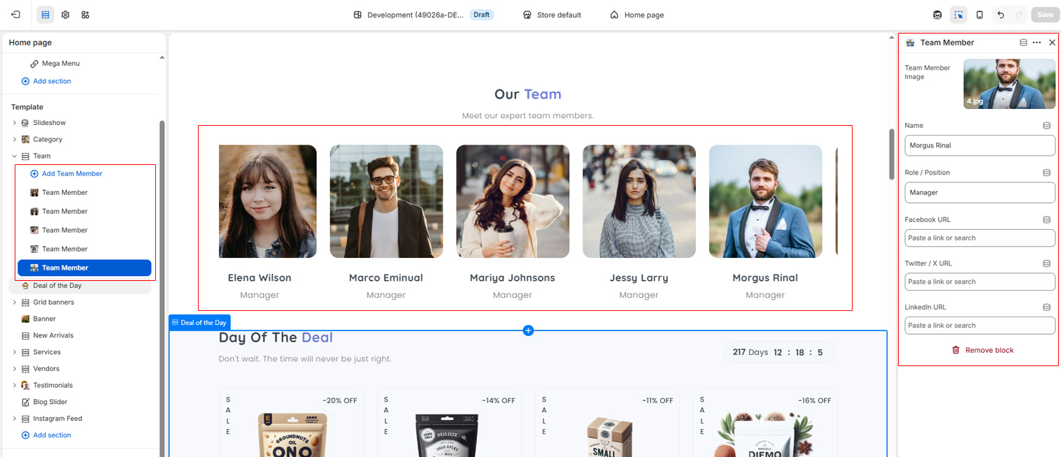
Here you can add blocks for team members to show team details. Select team block and goto right sidebar settings, adjust a team member's image, social media and details.
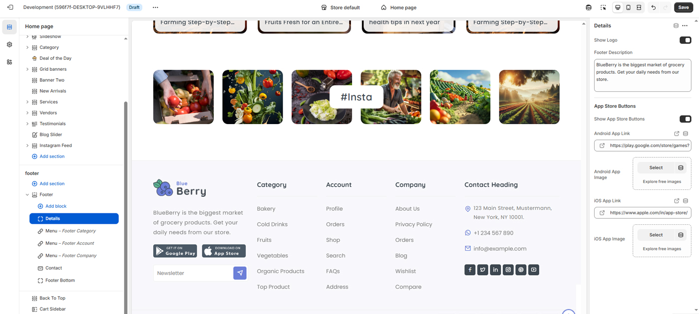
The Footer section allows you to manage and customize all bottom-area content of the website, including branding, navigation links, contact information, app download buttons, and copyright details. This section helps improve usability, trust, and accessibility for users.
Footer Menus
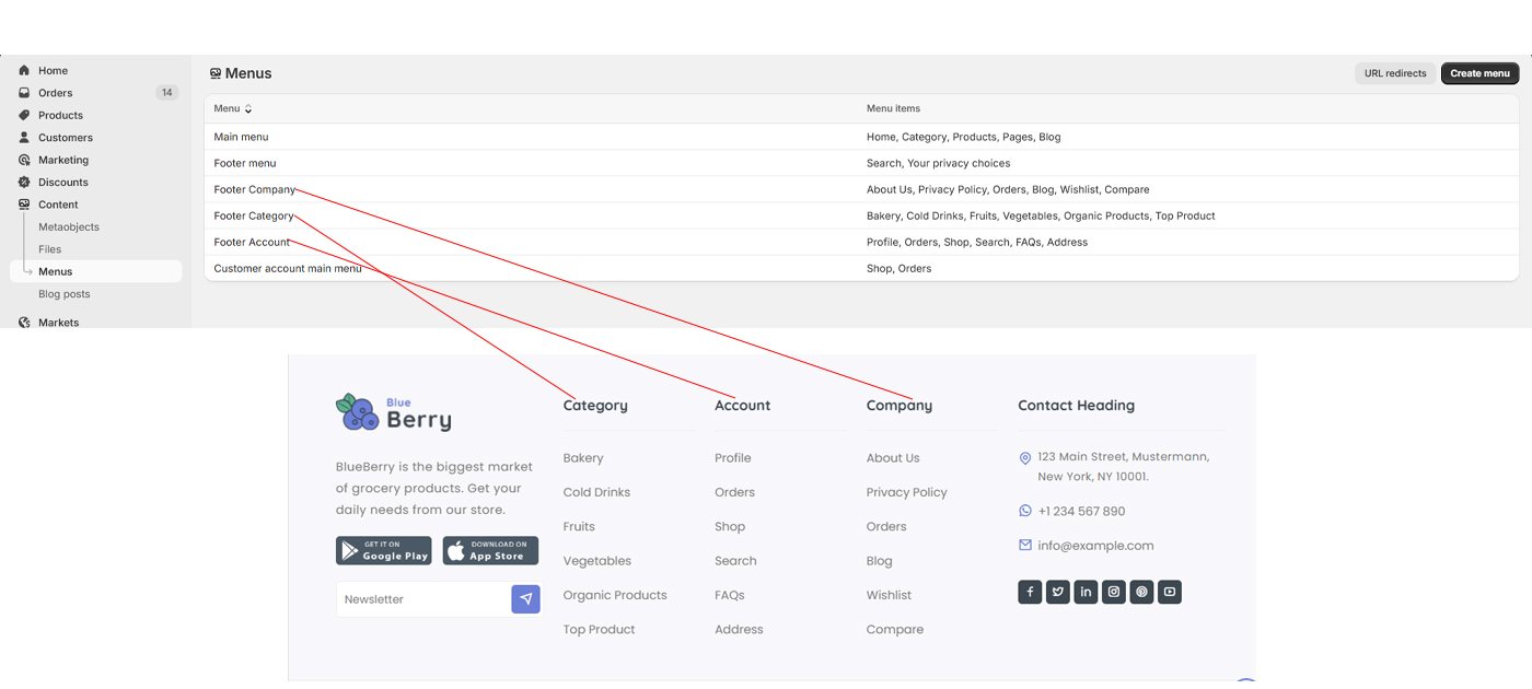
You can add, edit menus for footer list with links.